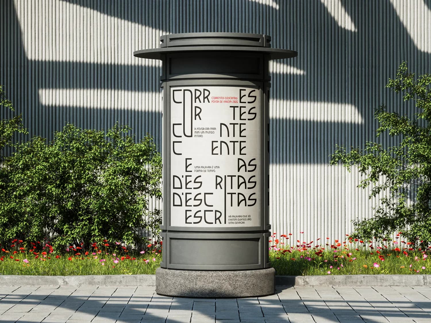
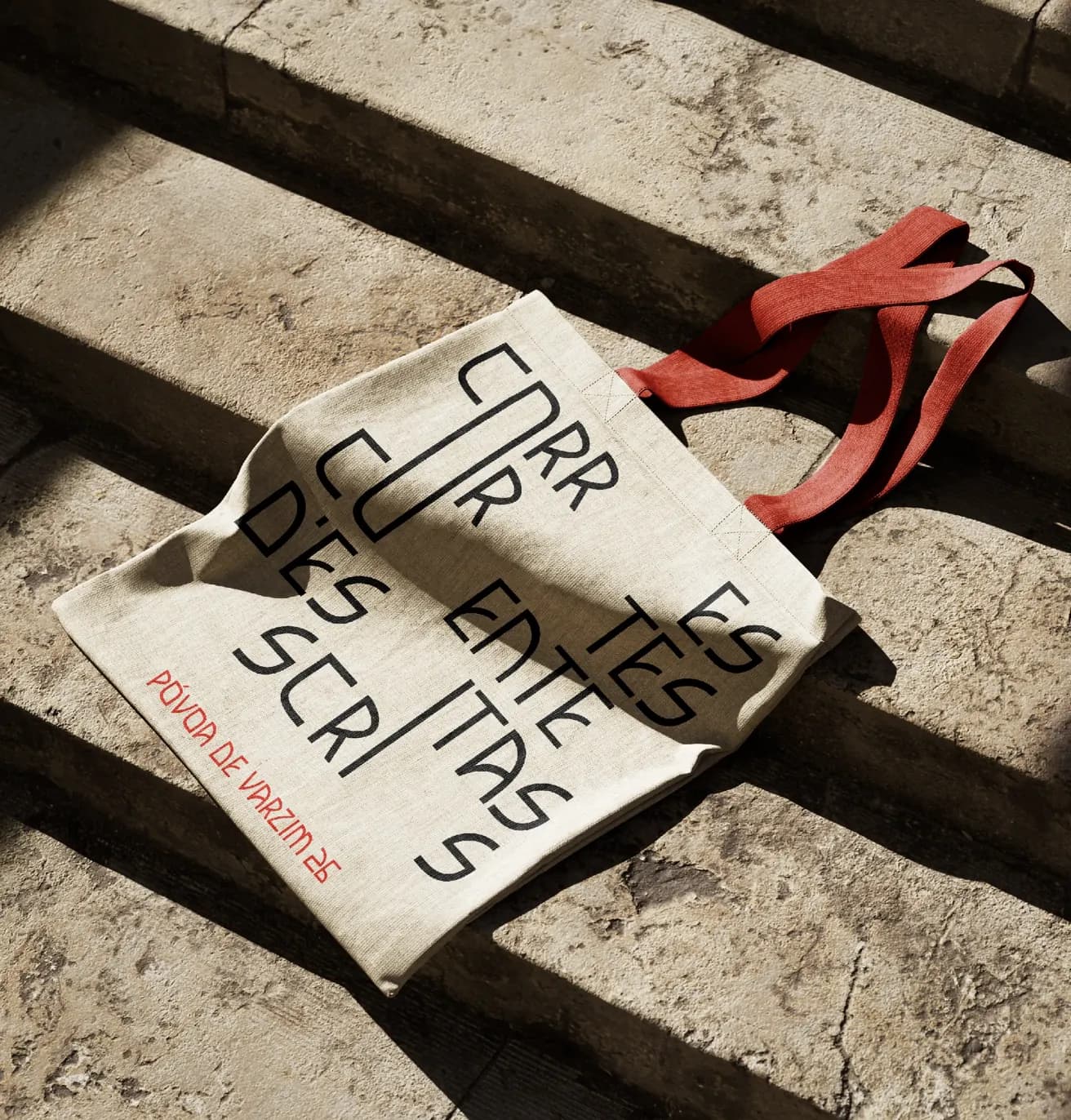
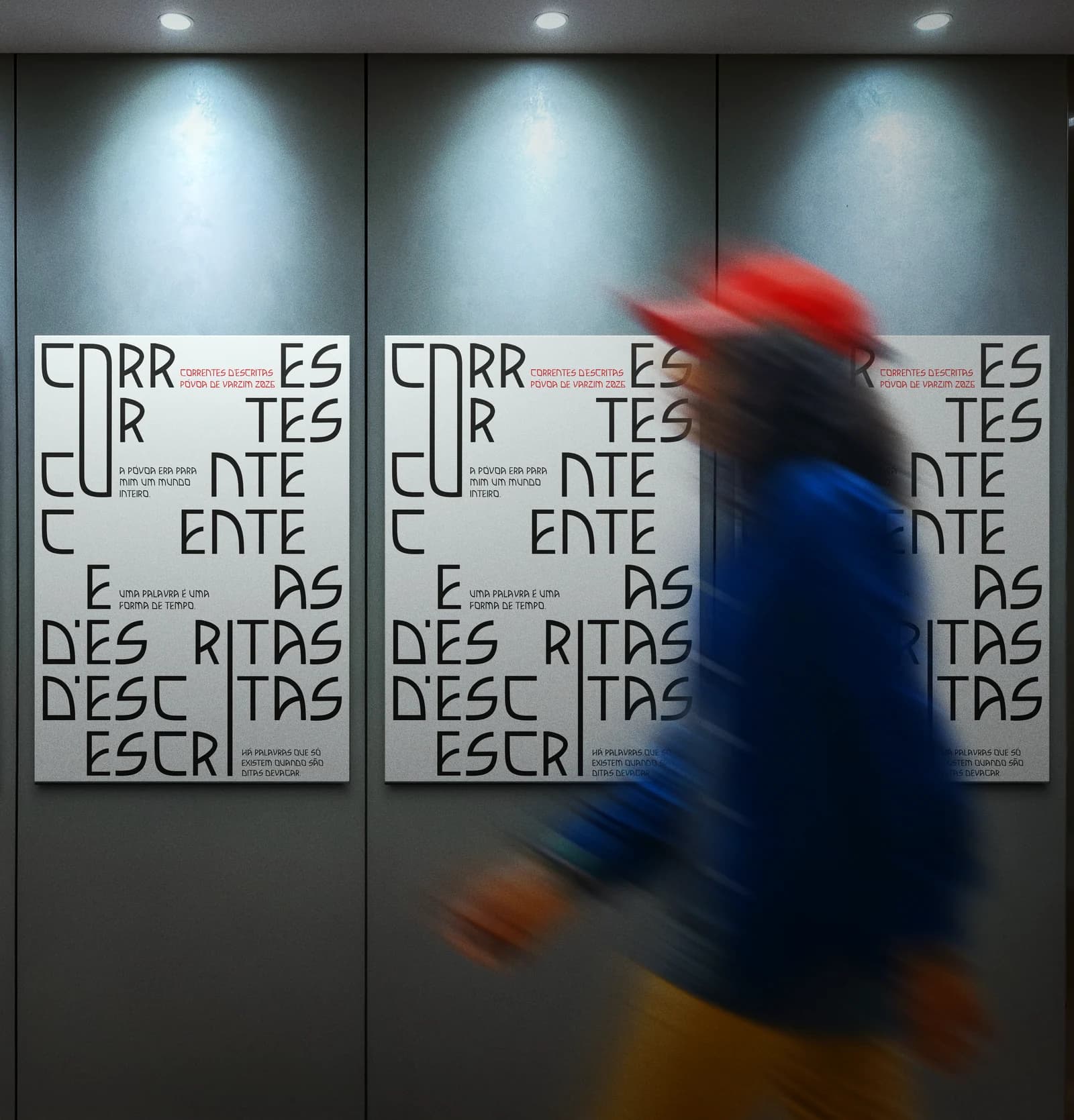
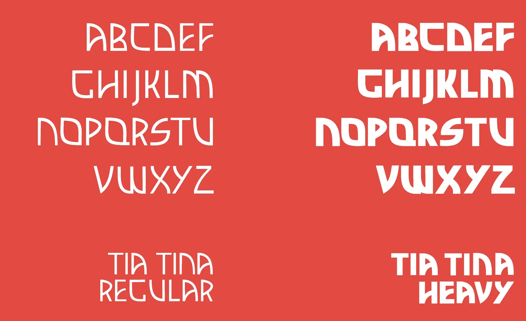
This visual identity was created for the 2026 edition of Correntes d’Escritas literary festival as part of the Font Design course, guided by Professor Pedro Amado. This project was developed in collaboration with my colleagues Bruna Dantas and Bruna Gonçalves.
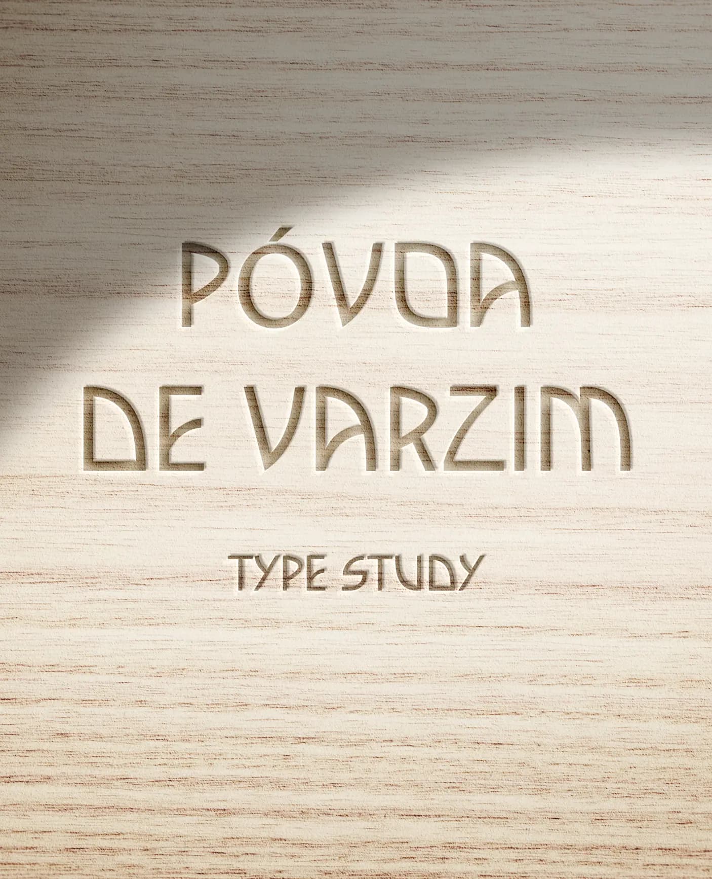
The assignment consisted of designing a digital typeface inspired by the work of Portuguese typographer Manuel Pereira da Silva. Our typeface, named Tia Tina, reinterprets his letterforms while introducing a contemporary approach. The identity was then applied to a poster promoting an event of our choice.
We chose Correntes d’Escritas literary festival 2026 because it’s one of Póvoa de Varzim’s most important cultural events. This project celebrates the connection between local typographic heritage and contemporary graphic design, using the custom typeface as the main visual element to create a distinctive and expressive identity.