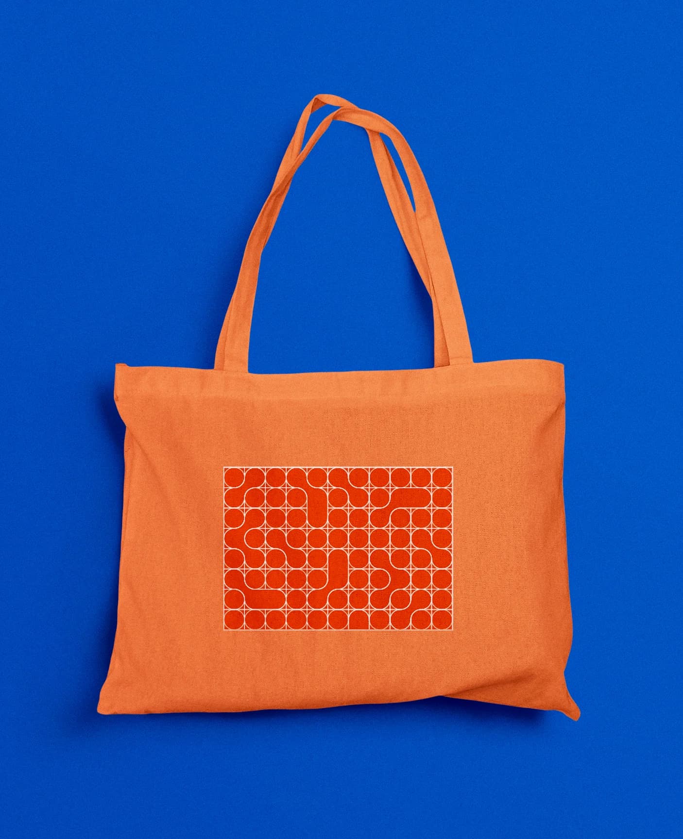
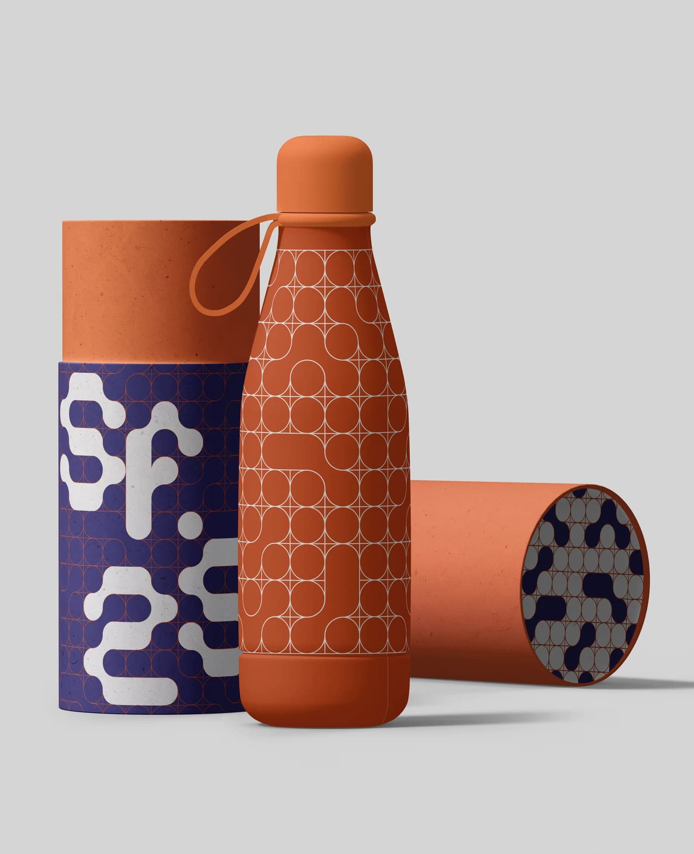
SF.25 - Serralves em Festa 2025 is a visual identity redesign developed by me and my colleague, Bruna Gonçalves, as part of the Project 3 course during the second year of the Bachelor’s Degree in Communication Design at the Faculty of Fine Arts of the University of Porto.
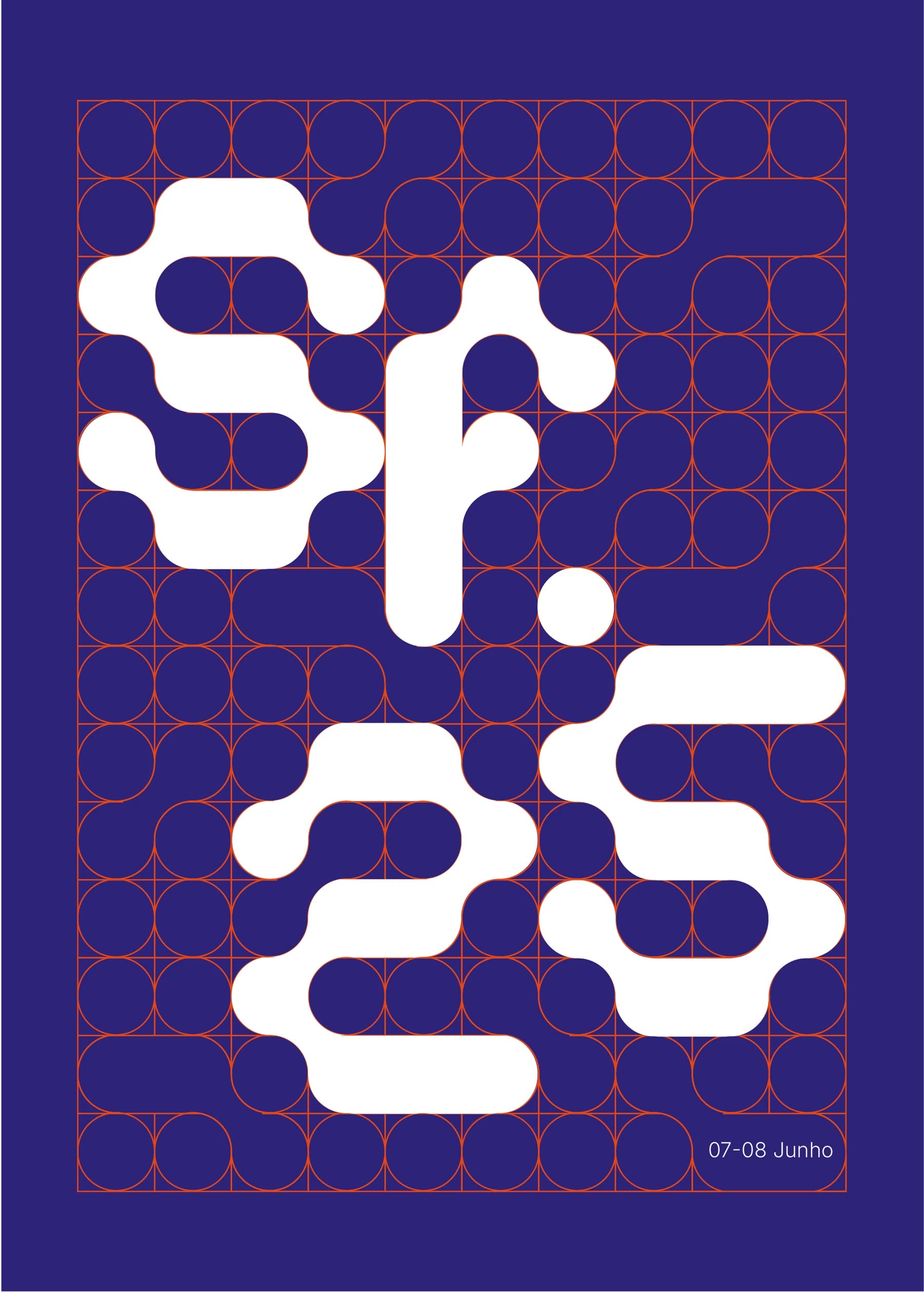
The project explores a modular graphic system built from a single geometric element, the dot, which serves as the foundation for a custom typeface and a visual language.
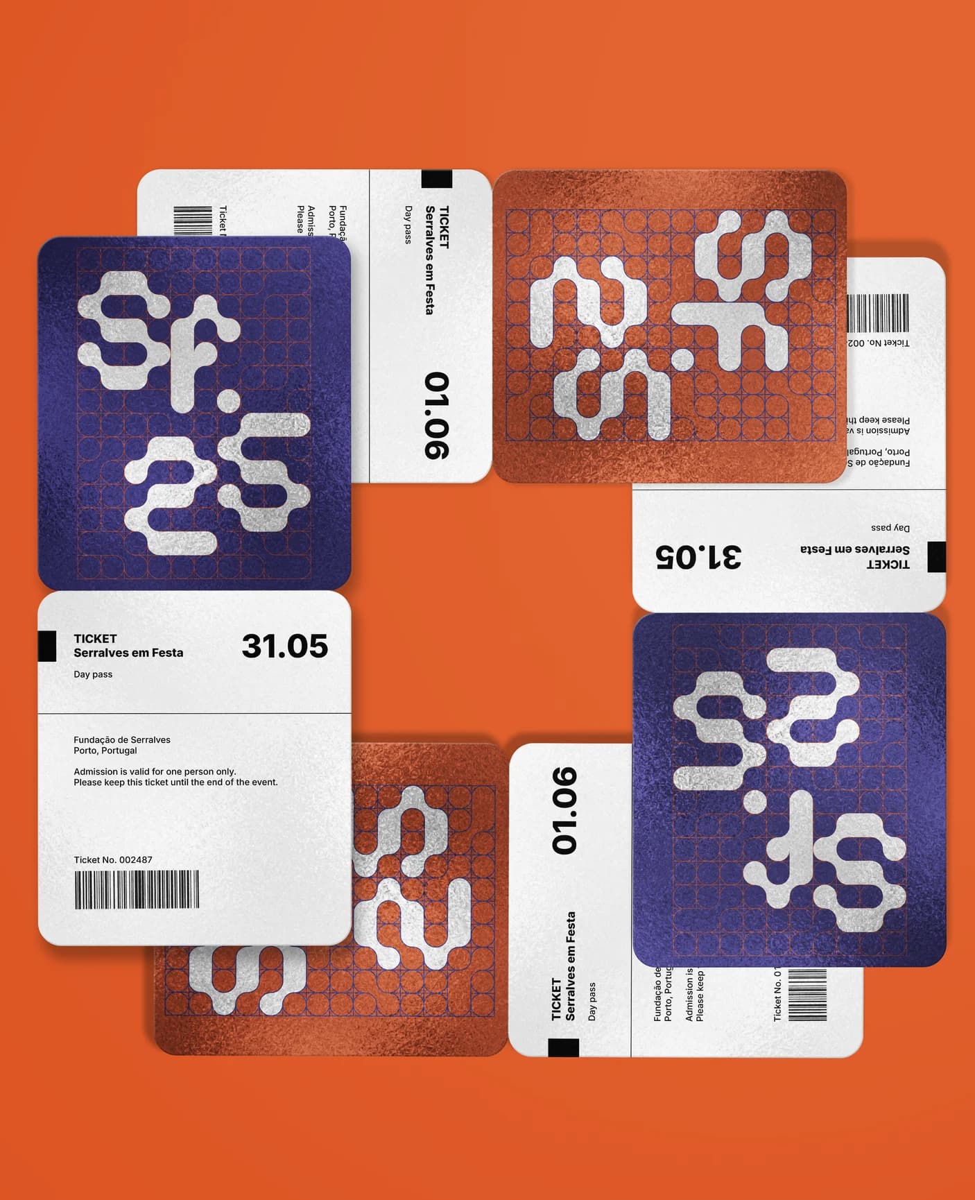
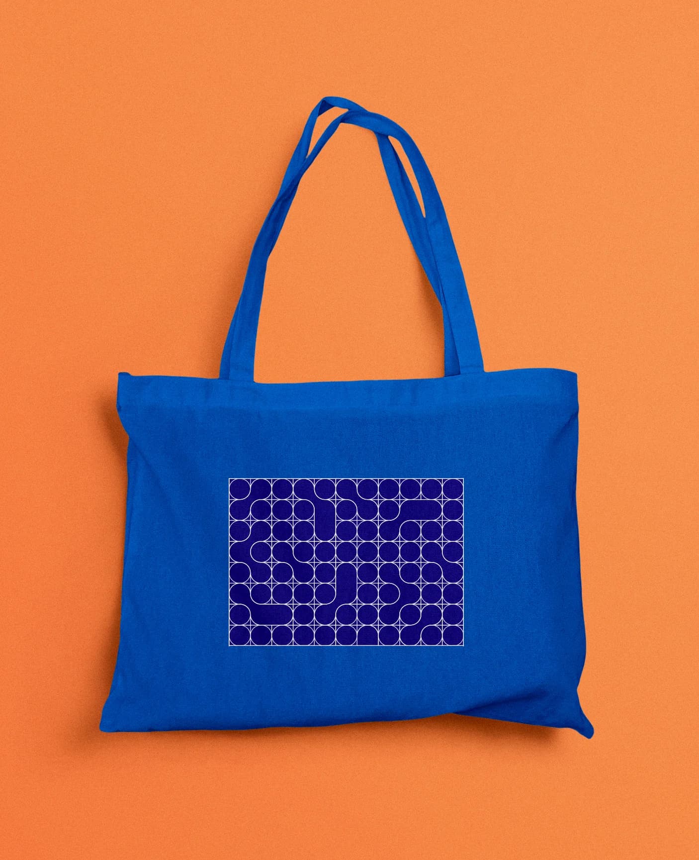
Based on rhythm, repetition and a personalized grid, the identity was designed to adapt across multiple applications while being recognizable and maintaining consistency.
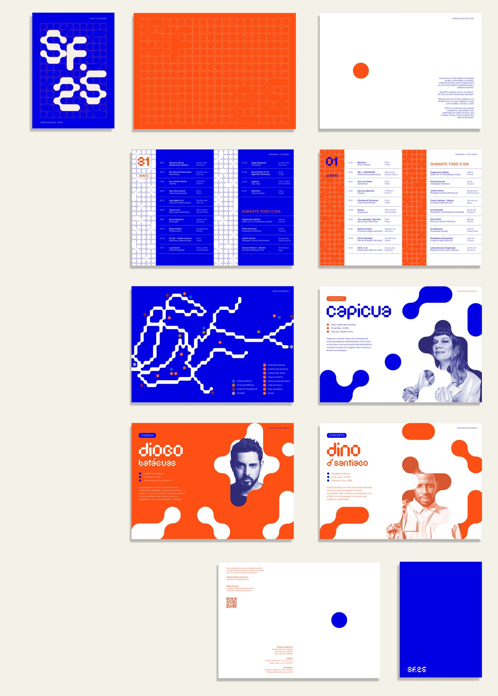
The actual project was an editorial publication, developed to showcase the identity in practice, including the festival programme, venue map and featured artists. With this publication, we wanted to demonstrate how a single dot can become an entire identity.